Data Visualization Dashboard for Fraud Analytics
Graduate Design Project / Duration: 7 weeks
The design brief for the project was provided by FICO for a revised employee portal. The challenge at hand was to create a portal to be used by FICO analysts in the monitoring and prevention of credit fraud.
Analysts use rulesets for each of their projects with rules that create cases when credit charges should be denied or reported as fraud (for example: spending over a certain amount at a certain merchant). Analysts can use hotlists to manage specific accounts that have been flagged or highlighted.
Background
Goals
Create a set of data dashboards that improve the overall experience of reviewing operational and statistical data
Utilize data visualization principles to provide users with quick at a glance analyses and the ability to dive deeper
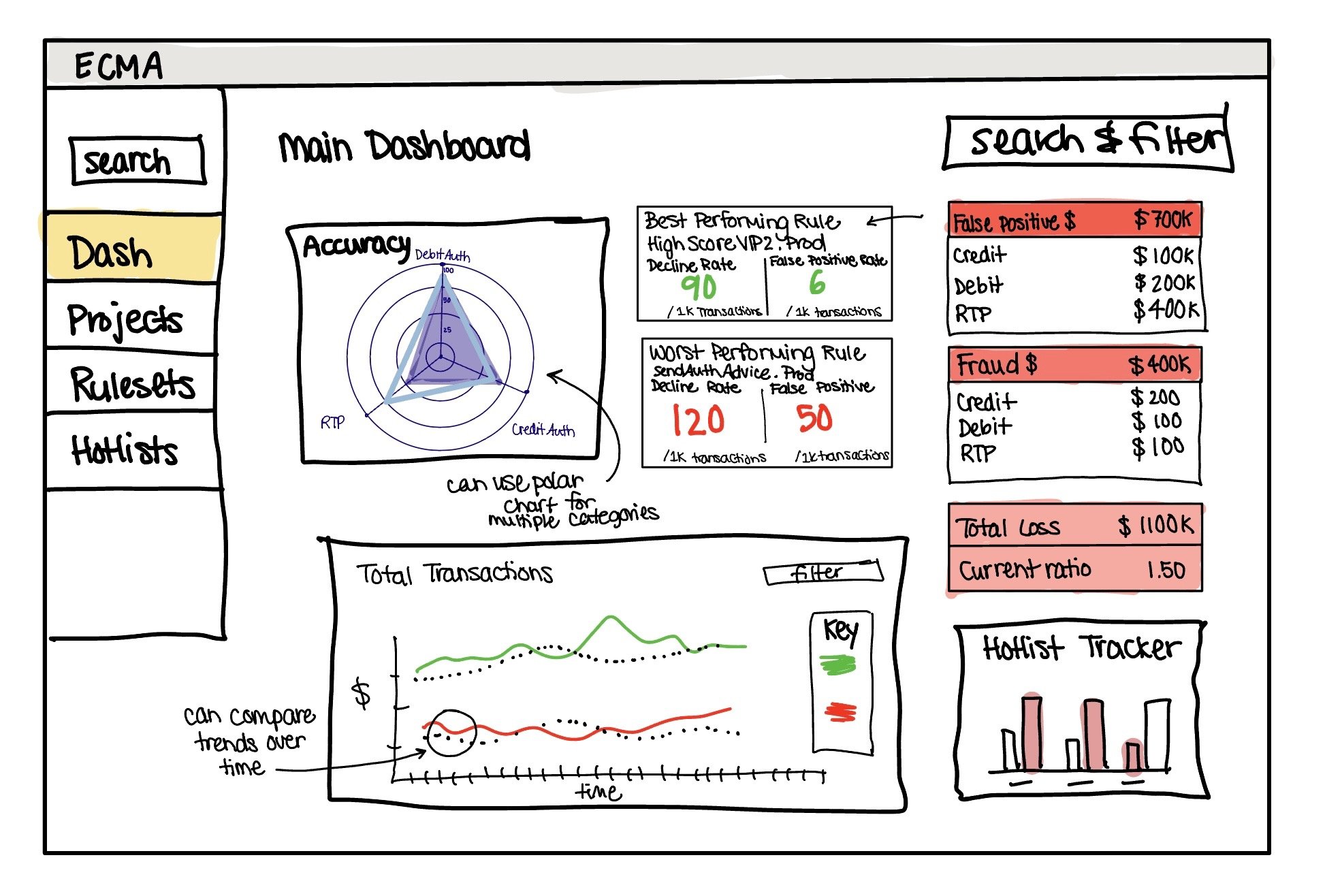
I began my design process by creating user personas, user flows, and a conceptual model (object-action matrix, transactional attributes, prioritization matrix).
Ideation
Information Architecture
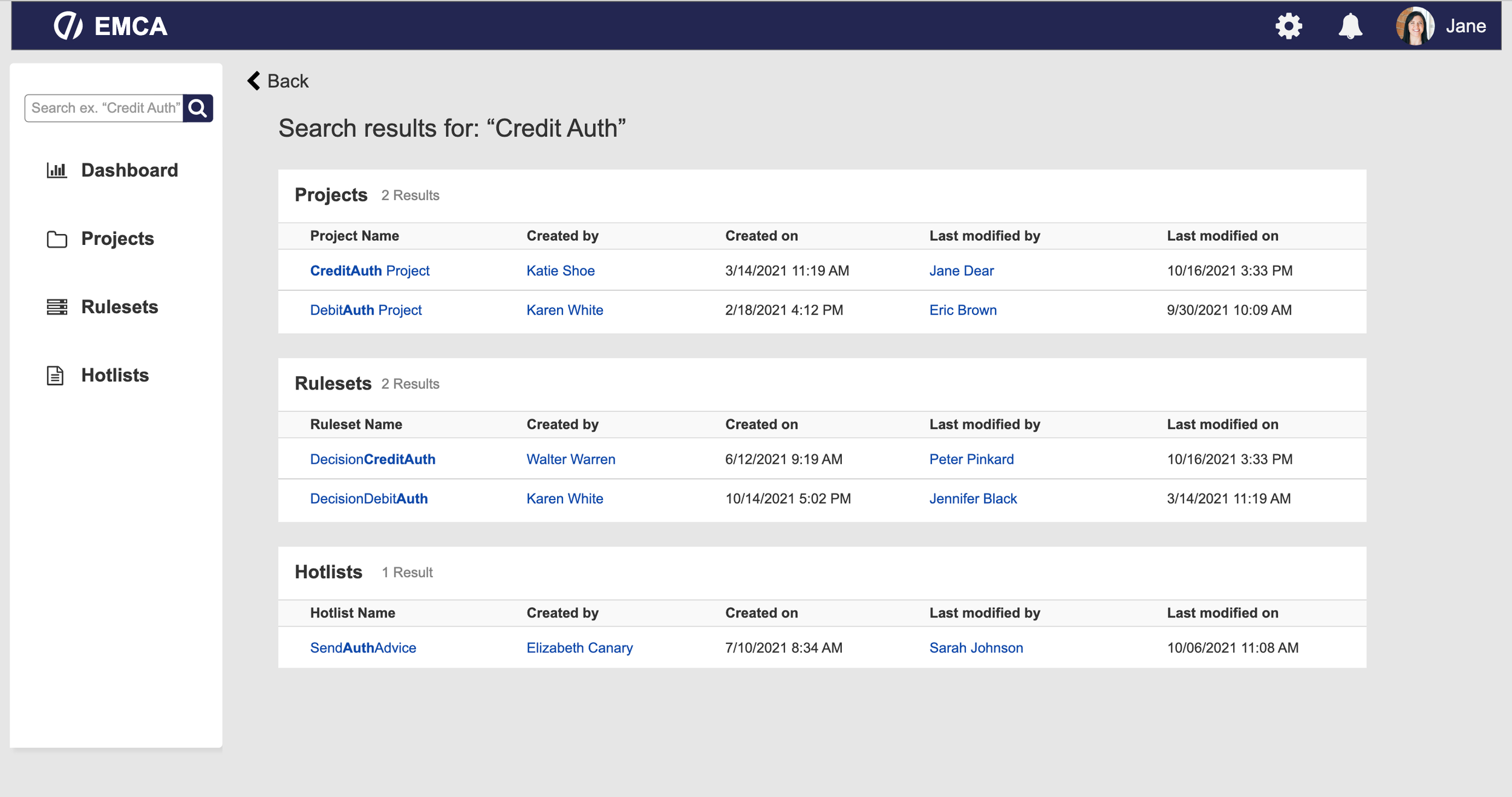
Browse & Search Design. This architecture uses object based organization with most content divided between the three main groups of projects, rulesets, and hotlists. Labels are based off of the object-action matrix. Global search exists on the main sidebar menu and the filters on each page have the ability to filter by the attributes of each entry such as dates, times, values and amounts, and by individual contributors. Sorting logic is predominantly time based however the user is able to change sorting preferences from any of the category headers.
Word Design. The voice is professional and clean, with clear bright colors. I used green and red for positive and negative indicators. The tone & vocabulary are business centered: using clear and professional industry terminology. Descriptors are brief to save time and space and hover overs provide more in depth information. The taxonomy is primarily task and action based.
Data Visualization
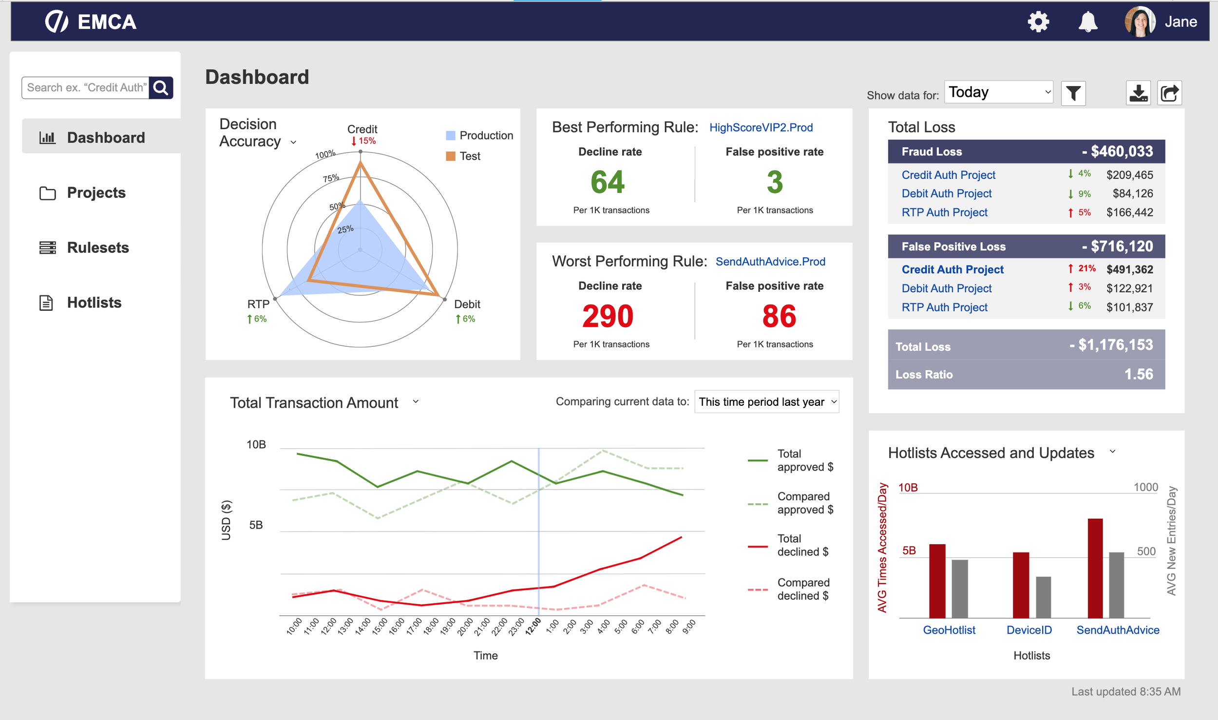
Comparison. I wanted users to be able to view comparisons on the main dashboard using the large ‘Transaction Amount’ graph to compare the total declined and accepted amounts over time to the same time period from the past as well as various averages. Objects can also be compared to each other such as different hotlists to each other and different projects to one other. The ‘Decision Accuracy’ chart allows for comparison between the three rulesets.
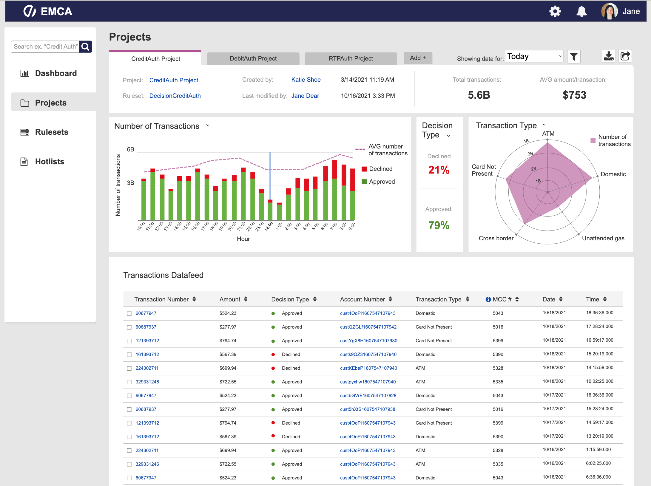
Categorization. The interface is primarily categorized by object (Projects, Rulesets, and Hotlists). Projects are categorized by project name (Credit Auth, Debit Auth, and RTP Auth), Rulesets are categorized by ruleset name (DecisionCreditAuth, DecisionDebitAuth, and DecisionRTPAuth), and the same is true for Hotlists.
Normalization. Normalization was used for: Total transaction amount per hour (or by date, able to switch), number time hotlist accessed per day (average), number of transactions over time, number of transactions per project over time, average transaction amount per project, number of decisions over time by ruleset, number of rules per ruleset, number of times accessed per 1K transactions for each hotlist, and average hotlist updates per hour (by rule).
Micro-interactions. These were used within most individual charts to give users the option to toggle between different scales, colors, and chart types.
Final Design & Reflection
My design was well received by our sponsors at FICO. However, this interface could use some increased personalization to each user. I think that it would be beneficial for users to be able to customize their own dashboards by deciding which charts are most helpful for their job, or in case it varies day by day. Additionally, there could be an option for users to create their own charts from scratch by selecting their own axes and variables that they would want a feed on.
View final screens below ⇩


